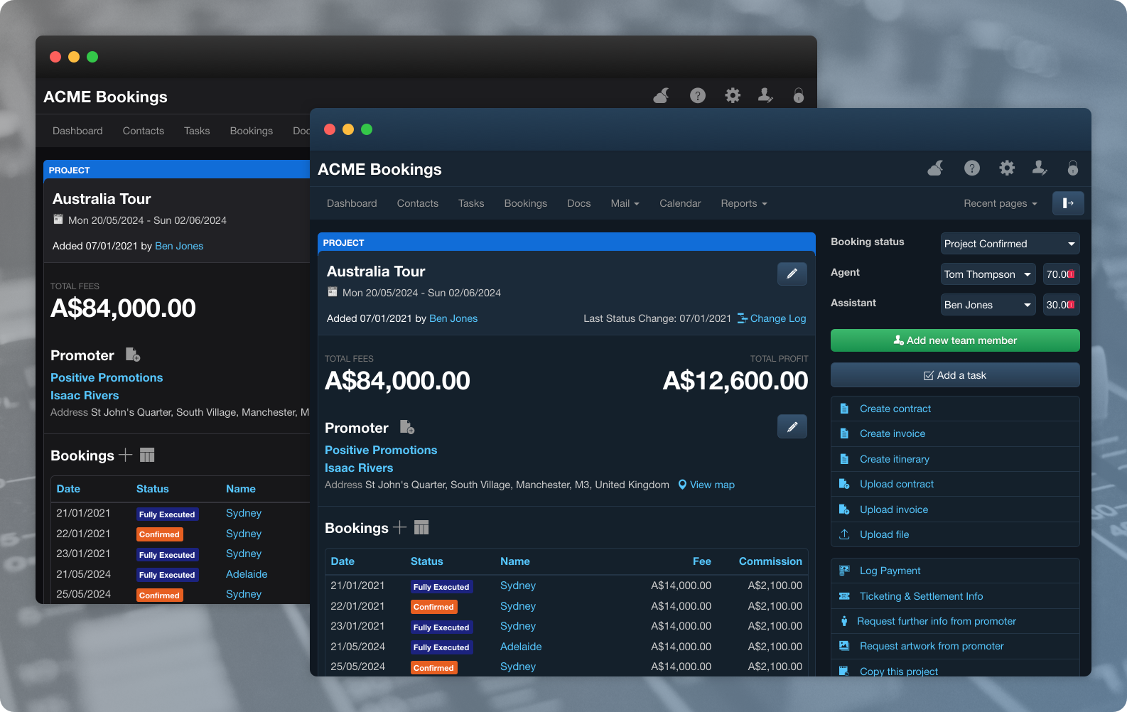
Dark Mode is à la mode at the moment! Other major web apps have followed the Apple design style, most notably Youtube with its dark UI option. When we began using dark mode in macOS Mojave we decided that it would make a welcome optional addition to the Overture experience.
Building on the success of Dark Mode in Overture, we have added another colour scheme: Dusk Mode! This new option provides a softer tone for low light conditions, making it the perfect choice if you find Dark Mode too stark and harsh on your eyes.

We are sure that there are a fair few Overture users that like to burn the midnight oil or are just out late at artist events where a darker UI would be a welcome break for tired and strained eyes. Now with Dusk Mode, they can enjoy an even more comfortable viewing experience.

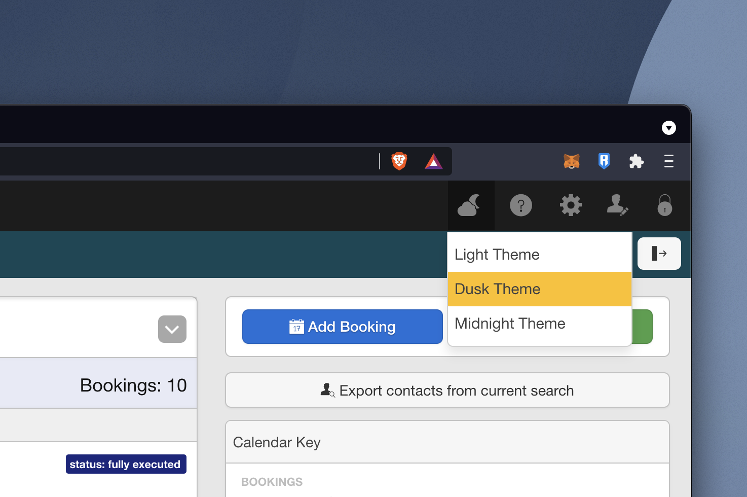
Accessed with the same ‘Moon and Clouds’ icon, which now opens a dropdown menu, allowing you to toggle between the 3 theme options. It’s very easy to switch between modes; just click to activate and again to de-activate if you’re not keen.
